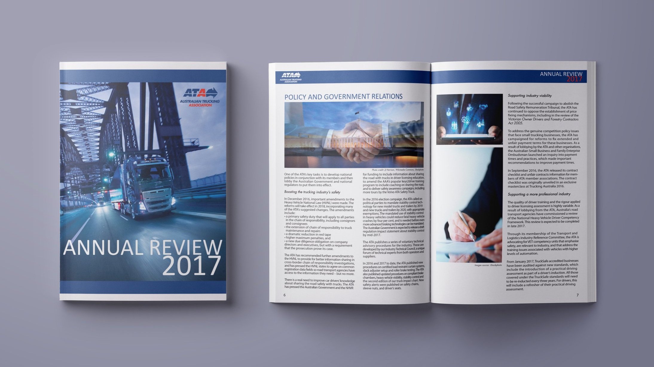
ATA Annual Review 2017 Magazine
The Australian Trucking Association contracted me to design and typeset their 2017 Annual Review Magazine. This magazine was prepared for both print and online for internal and external stakeholders, partners and sponsors to access.

Total 28 pages including front and back covers
The Australian Trucking Association required a lot of data and information recording in a total of 28 pages. This was a difficult task considering the amount of data, articles, social media content and images that needed to be highlighted in the magazine. I designed a very basic layout, with no loud imagery nor design elements to deter from the intended message of the annual review.
Making Data Dynamic
While the layout is very basic, I typeset the entire magazine to be dynamic and impactful in terms of text layout. I focused on highlighting the text and information into a flow and transition that keeps the eye moving from one page to the next.
Additional elements for ATA’s modern rebranding
With the appearance of CEO Ben Maguire, the aged look and feel of the Australian Trucking Association needed a refreshed image. On top of making the annual review more technology-driven in terms of imagery sourced by me, Ben also requested for little details to be designed for the website and social media channels. This included a Friday Facts segment on the website.
I designed this banner to be direct, impactful and focused on the colours of the ATA logo.
As part of the rebranding, I was also tasked to design large signages and exhibition panels for their traveling exhibitions. This included a Large Truck Combinations Statistics wall decal. I studied the data and statistic provided to me, and came up with this layout that allowed readers and viewers to digest the information without feeling overwhelmed. I maintained the same bold text and borders that I designed for the other rebranding elements.


